
A PERT chart is a project management tool used to schedule, organize, and coordinate tasks within a project. PERT stands for Program Evaluation Review Technique, a methodology developed by the U.S. Navy in the 1950s to manage the Polaris submarine missile program. A similar methodology, the Critical Path Method (CPM) was developed for project management in the private sector at about the same time.
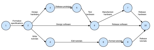
A PERT chart presents a graphic illustration of a project as a network diagram consisting of numbered nodes (either circles or rectangles) representing events, or milestones in the project linked by labelled vectors (directional lines) representing tasks in the project. The direction of the arrows on the lines indicates the sequence of tasks. In the diagram, for example, the tasks between nodes 1, 2, 4, 8, 9 and 10 must be completed in sequence. These are called dependent or serial tasks. The tasks between nodes 2 and 3, and nodes 2 and 4 are not dependent on the completion of one to start the other and can be undertaken simultaneously. These tasks are called parallel or concurrent tasks. Tasks that must be completed in sequence but that don’t require resources or completion time are considered to have event dependency. These are represented by dotted lines with arrows and are called dummy activities. For example, the dashed arrow linking nodes 6 and 9 indicates that the system files must be converted before the user test can take place, but that the resources and time required to prepare for the user test (writing the user manual and user training) are on another path. Numbers on the opposite sides of the vectors indicate the time allotted for the task.
The PERT chart is sometimes preferred over the Gantt Chart, another popular project management charting method, because it clearly illustrates task dependencies. On the other hand, the PERT chart can be much more difficult to interpret, especially on complex projects. Frequently, project managers use both techniques.
Also Read…

2 thoughts on “PERT Charts”